


Many years ago the New York Times posted an interactive graph allowing users to draw the line that they felt best captured the statistical relationship between a family’s income percentile and the percent of children who attend college (“You Draw It: How Family Income Predicts Children’s College Chances” by Gregor Aisch, Amanda Cox, and Kevin Quealy, May 28, 2015).
When I took my guess drawing the line, I drew what I imagine most people would: an exponential line. Because it only makes sense that the more money a family has, the more likely they can send their children to college…right? Apparently not. According to NYT, the line is linear.

I was shocked, thinking: No, this can’t be! Economic inequality surely affects college attendance more dramatically than just linearly! And unsurprisingly, a lot of people felt the same way as me.
So what’s going on? The truth is that the way this NYT graph is set up has a fundamental flaw: it compares parents’ income to other parents’ income, not to the costs of higher education. Let me explain.
So what is a “percentile”? A percentile measures how a certain data point stacks up compared to other data points. Therefore, a family whose income is at the 50th percentile has a lower income than 50% of families and a higher income than 49% of families. Using relative income as the x-variable in this comparison is highly problematic because the difference between a family at the 10th percentile and the 20th percentile can be just a few thousand dollars, whereas the difference between 90th percentile and 100th percentile can be hundreds of thousands of dollars.
Furthermore, a student’s likelihood of attending college depends on actual affordability, not just rank compared to other families. For example, a family at the 20th percentile might barely be able to afford community college, while a family at the 90th percentile could send their children to private universities without aid. That’s why you have to look at how much a family actually makes, not just how much they make compared to others.
When you correct the graph, setting the x-variable to parents’ income, instead of percentile of parents’ income, you get the following graph (taken from “Data Jam Session: Digging into the NYT teaser about college rate versus parent income” by Vanessa Boehm, May 17, 2021):
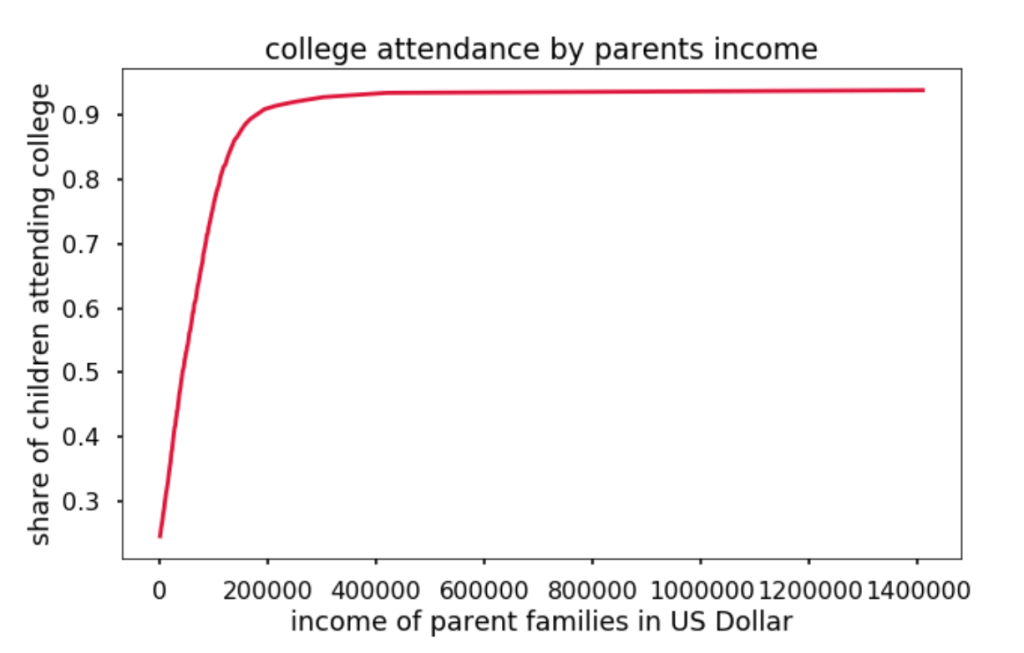
Big difference, right? This shows the real story behind college attendance. While attendance does hit a near-linear line eventually, this doesn’t happen until after ~200k dollars in family income, which is much more than the average American makes.
All in all, the NYT graph masks the full complexity of this issue as it fails to show the actual pressure points that income has on college affordability. In the digital era, we have to be careful about the type of data and results we believe, even from from supposedly reputable sources like the NYT, and a good first step is to look past the graph itself and question the choices behind it.

Leave a comment